📄 Download a PDF version of this article
Caroline walked out of the bathroom and said, ‘My hair was all sudsy with shampoo when the water in the shower stopped.’
Uh oh.
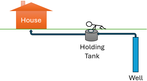
You see, we live out in the country, and we get our water from a well. The well pumps into a thousand-gallon holding tank, and the holding tank pumps water to the house (see Figure 1).
When there’s no water to the house, it’s a real problem – our problem.
We ran out to the holding tank, and I took off the lid. We looked down in and saw... a great ... big ... empty. No water.
Drat!

Caroline tried calling for a water truck. No answer. Then, we realized it was Labor Day, and no one was working.
Double dog drat!
We lived on jugs of water until a truck came and filled our tank a couple days later. But this wasn’t the end of the story. It was just the beginning.
Read on to learn about the rest of the adventure, and to find out how much personal and public data can reveal – when you make the effort to collect and gather it. If you’ve ever worried about water, drought, or sustainability, I think you’ll relate.
Tracking the Tank (and the Drought)
Our well guy came and tested the pumps in the well and the holding tank. They were still working properly. What wasn’t working was rainfall.
We were experiencing a drought.
We wondered, ‘How long would 1000 gallons last?’ To keep track, every day I measured the water level in the tank with a tape measure – see the blue line in Figure 2. From the time the truck first filled our tank in September – and again in November – you can see that the water level dropped,
and dropped,
and dropped.
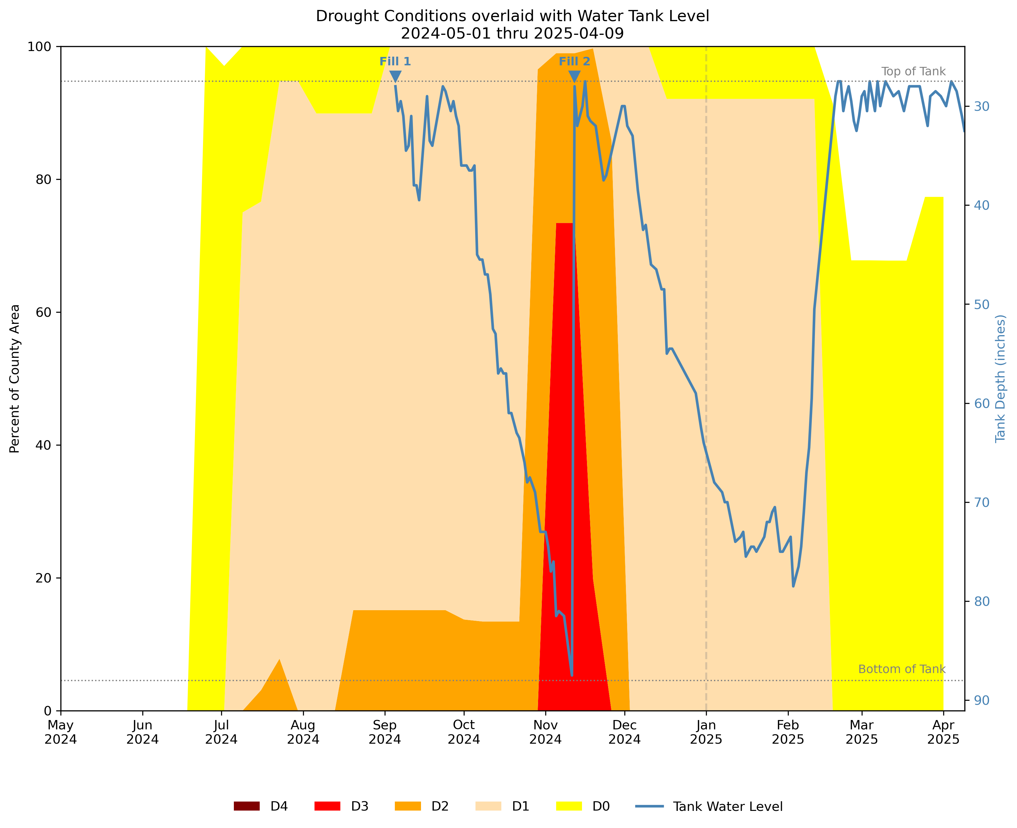
During that same period, the drought1 continued and even worsened, as shown in the background of Figure 2. The yellow, tan, orange, and red colors indicate progressively more severe drought conditions2. If you want more detail on the data or how I made the plot, dig into the Appendix.
You can see that more and more of the county experienced deeper and deeper drought on into November when it reached its peak – which was also when we got our second water delivery.
Amid the gloom and despair of the drought, there were some bright spots. Every time we left home – for a wedding, a vacation, or Thanksgiving – the water level rebounded a bit as you can see by the occasional upward spike on the chart. That told us the well was still pumping water, just not enough to fully meet our daily needs.
Another silver lining: the decline wasn’t as steep as expected. The average American household of two adults uses 160 gallons of water each day. But our tank level dropped by only 15 to 30 gallons per day. So instead of needing a thousand gallon delivery every week, we didn’t need one for 2 months. That suggested our conservation efforts were making an impact.
The Long Decline and The Turning Point
Nevertheless, the continual decline was depressing. Each day I trudged out to the tank, and each day I measured a lower water level. Through December, Christmas, New Year’s Day and into early 2025, it seemed like we were finally getting some regular precipitation (mostly snow), but its effect wasn’t showing up in the tank level.
By mid-January, I was expecting to call for another fill-up. But then, the water level started bouncing around (see Figure 2):
First it was up... then down... then up again... then down hard.
My emotions mirrored the changes in water level:
Happiness... then sadness... then cheer... then dejection.
But on Feb. 8th, I measured a solid upward jump of 4 inches – on the heels of a 3.5 inch rise the day before and 2 inches the day before that. The next day I saw another 2.5 increase, then 5, then 9. We had gained 26 inches in 6 days!!!
Amid all this excitement, we left home for a week-long vacation to visit friends and family. When we returned, I hoped against hope as I walked out to the holding tank. What would I find? I lifted the lid with one eye open. Then, I opened my other eye took a good look...
The water level was at the very top of the tank – a gain of 21 more inches since we had left for vacation!!
Woo hoo! Joy! Relief!
But I soon felt ... wary. ‘Would the level hold?’ and ‘Would the precipitation continue?’
Yes and yes.
The water level has remained at the top of the tank ever since. In lock step with what I was seeing in our tank, the drought situation improved across the county – moving out of Moderate Drought (D1) into Abnormally Dry (D0) in February and exiting drought status entirely in April!
What I Learned and What’s Next
There’s something special about collecting your own data every day, by hand, come rain, or snow or sunshine – especially when you’re trying to fix or manage a problem. At the very least, tracking the water level helped me know when to call for a truck to come and fill our tank. And pairing my data with the Drought.gov data gave me much more context and understanding than I ever would have had without it.
But ultimately, for me, producing the plot in Figure 2 provided the big ‘Ah ha!’ moment. Being able to visualize the full picture – the initial problem, the long decline, and the big turnaround – gave me much-needed perspective. I could see that we weren’t the only ones being affected. Our entire county, and even the whole of western PA, was feeling the impact of the drought.
Are you facing a challenge – at home, at work, or in your community? Consider collecting your own data. Track what matters, visualize it, and use it to help make decisions. You don’t need to be a data scientist. You just need to be curious, and patient, and willing to collect and gather data. You will gain insight.
Already actively doing a project like this? Please drop me a note. I’d love to hear what you’re working on!
Appendix: Data, Tech Challenges, and Code
As described in the main body of this article, I used two data sources and combined them to better understand our situation. The first source was the water level data that I collected myself. You can find it as
holding-tank-water-level.csv
in the GitHub repo for this article. I accessed the second source, local drought monitoring data, from the Drought.gov page for Washington County, PA. For your convenience, you can access it from the same repo – look for
usdm-washington-county-pa-2000-to-present.csv
I found creating the plot in Figure 2 to be challenging. The drought data is updated on a weekly basis, but I was collecting the water-level data (mostly) every day, sometimes even a couple of times per day. To chart both datasets on the same plot, I needed to align them on a common time basis. If you ever need to do something similar, you might want to check out the code for the project,
plot-holding-tank-water-level-and-drought-monitor.py
which is also available in the GitHub repo.
Last, getting the drought data plotted properly required some special handling. I thought I could simply use a stacked (area) plot – but it wasn’t quite that simple. I needed to ‘diff’ the D0, D1, etc. drought series so they would stack properly. In addition, since I’m fairly fussy about plot aesthetics, I wrote a lot of code to position labels, reference lines, annotations, and the legend.
If you find the data or code helpful, please drop me a note. I’d like to learn more about how you are using it.
The drought data for our county comes from Drought.gov, an excellent resource where you can get charts, data, and alerts about local, regional, and national drought conditions. ↩︎
Per Drought.gov, the drought categories are: D0: Abnormally Dry, D1: Moderate Drought, D2: Severe Drought, D3: Extreme Drought, and D4: Exceptional Drought. ↩︎