picture of our solar panels

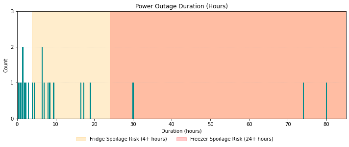
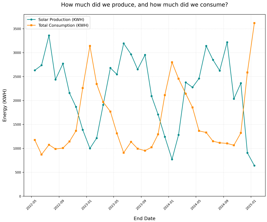
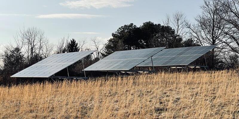
Four Questions Our Solar Charts Help Us Answer

Every week I update a series of charts that help my wife and me monitor the health and performance of our solar panels. Each visual answers a different question, and together they’ve changed how we think about our system. Find out what those questions are and what insights we’ve gained.

May 7, 2026 · 4 min · Tim Graettinger
Image of our cat Tiki inspecting the solar panels during installation

4 Years, 100 MWh of Solar Power... in Pittsburgh?

100 MWh of solar power in four years … in Pittsburgh? Who’d a thunk it? But after tracking every day of production during that time, I finally stepped back and asked: What does that number actually mean? Turns out, the stories behind it might be more interesting than the milestone.

April 13, 2026 · 5 min · Tim Graettinger
Image of laundry drying on a clothesline

Hang It Out to Dry — and Save 300 kWh

Did you grow up in a home where laundry dried on a clothesline? I did. Since we’re trying to conserve energy, we’re doing it again. I wondered if it’s worth it - and the answer surprised me.

October 5, 2025 · 2 min · Tim Graettinger
Chart of the number of power outages versus their duration.

It Was a Dark and Stormy Afternoon: How We Used Data to Prepare for Our Next Power Outage

The power went out and stayed out… for three days. How do you prepare for the next time?…

May 25, 2025 · 9 min · Tim Graettinger
Graph of our solar production and our energy consumption over time.

Is Our Solar Surplus Big Enough to Drive an EV for Free?

Can our solar system power our house AND an electric vehicle?…

March 3, 2025 · 6 min · Tim Graettinger