📄 Download a PDF version of this article
The Space Race: Our Struggle for a Meeting Place
Last month our Toastmasters club got shut out – again! – trying to reserve the Panera Bread community room where we regularly meet. Members were frustrated, asking, ‘Where else can we go?’
We’ve moved before: from a grocery store to a public library to the Panera. And we learned that other not-for-profit groups were also struggling to find meeting spaces. A leader from another Toastmasters club told us they found a home at a local high school. It sounded ideal: well-equipped with audio-visual tech, lots of seating, plenty of parking in the evening. And it was free! This inspired us to wonder: ‘Could we find a local high school convenient to our members?’
If your group needs a meeting space, if your business intends to move, or you just like looking at maps and thinking about distances and drive times – hang on. You’re in for a fun ride.
Mapping the Territory

When discussing our options, our club president said, ‘We sure could use a map!’
I blurted out, ‘I think I can make one.’
In my prior work experience, I occasionally made maps. But this would be my first time mapping with Python1. On the map, I wanted to display where our members live and where the local high schools are located. For the raw material, I first downloaded our club member file from Toastmasters.org. Then, I searched for nearby high schools on my phone and copy-and-pasted those addresses into a text file.
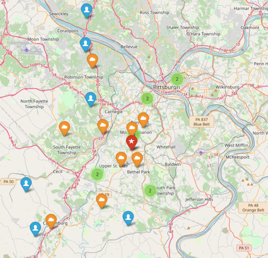
With help from Janet2, I produced the map shown in Figure 1. What did we learn from it?
The Panera location appeared to be centrally located relative to the members3.
There are five high schools in range of the Panera Bread that might be good choices for us.
Chartiers Valley HS (one of the five) intrigued us because it sits near Highway 79 – as did the grocery store and the library where we met in the past.
The map inspired all of these seat-of-the-pants observations. But we still didn’t see an obvious answer to the question, ‘Where should we meet?’
Give Me Some Numbers to Crunch... Please!
My quantitative side begged for some numbers to inform any decision we might make. But where to start? To me, a couple of obvious questions to ask were:
‘How far do members live from the Panera Bread location?’
‘How far do members live from the different high schools?’
I wrote some code to calculate the as-the-crow-flies distance from each member address to the Panera site. Sorting them, I found that an 8.1 mile radius4 included 80% of the members – call this the 80%-distance5.
I like the 80%-distance because we don’t want, say, just half of our members at a meeting. We want most members to be there, and 80% is a healthy fraction.
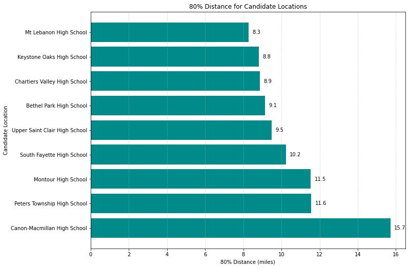
To rank the high schools by 80%-distance, I simply repeated the same calculations for each one. You can view the results in Figure 2. The top five turn out to be the same ones we noticed in the map as closest to Panera.
Distance vs. Drive Time
Something gnawed at me, though. We could see and measure distance, but I believed members care more about how long it takes to get to the meeting than they do about how far they drive. Our Panera Bread location sits in a heavily-congested area, and members need to travel there during a high-traffic period: the evening rush hour. They often arrive late to our 6:00 pm meeting, citing the miserable traffic.
I wondered, ‘Could we quantify drive-time to aid in our decision?’
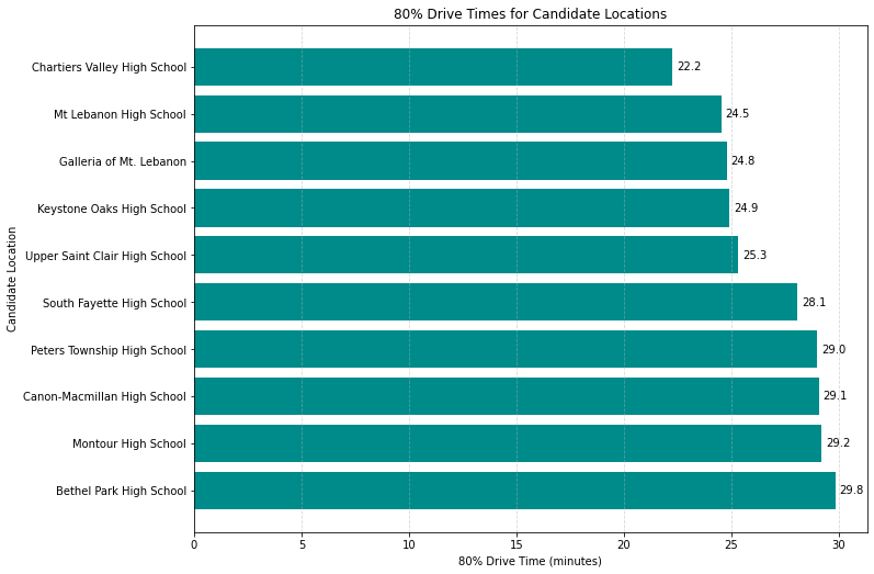
Working again with Janet, I wrote code to use the Google Maps API6 to calculate the drive times for our members: to the Panera and to the various high schools. Figure 3 presents the results.
Rising Thru the Ranks: A New Hope
Wow! Through the lens of drive time, the story changed significantly. Ranked by distance, Panera Bread came out on top. But ranked by drive time, it dropped to third. Chartiers Valley HS jumped to the top, possibly due to its proximity to a major highway.
On the flip side, Bethel Park HS fell off a cliff. Fourth by distance, it ranked last by drive time. Having lived in Bethel Park, I can attest to the traffic snarls that might account for its plunge in the rankings.
The club officers (including me) digested the map and bar charts. We felt like we had a quantitative answer to our original question, `Where else can we go?’: Chartiers Valley High School. It’s our best candidate based on the drive time analysis.
The Road Ahead and a Look in the Rear-View Mirror
Our next step is to contact Chartiers Valley HS. We want to ask if we can meet there and do a site visit to see if it will suit our needs.
Looking back on this project, I learned or re-learned some important lessons:
Maps help us visualize geography which still plays a key role in modern life. Here, we could see where members lived and where we might go for future meetings.
Drive time matters. Most people experience drive time every day. For our club, the drive-time perspective painted a much different picture than pure distance.
Combining insights both from the map and the drive-time analysis, our club made an informed choice for a new meeting location.
How are you using maps, geographic data and analysis to make decisions in your life or in the life of your group or business? Please drop a comment and tell me what you’re working on. I’d love to hear!
Appendix: Extras for the Tech-Inclined
If you want to take a deep dive, all the code I used for this project is posted on GitHub. But here’s a little taste of the process for turning addresses7 into a map.
Read a street address, city, state, and zip code from a file and concatenate those items into an address string.
Geocode the address string, turning it into a (latitude, longitude) pair. To do this, you will need a geocoder. I used the Google Maps API – more about that shortly.
Supply the (lat,long) to a map visualization package, like Folium, to put a marker on a map.
Repeat the above for all of the club members and all of the high schools, using one marker type for members, another for the current location, and yet another for the candidate high schools.
Save the map as an html file to share with others.
To concatenate the portions of the member address into an address
string, Address:
# Assuming columns:'Addr L1','City','State/Province','zip-code'
members_df["Address"] = members_df["Addr L1"] + ", "
                      + members_df["City"] + ", "
                      + members_df["State/Province"] + " "
                      + members_df["zip-code"]
To geocode the addresses and add the latitude and longitude elements to
the members_df dataframe, several steps are involved. First, you need
to import the relevant packages and initiate a connection to the Google
Maps API using your secret key8:
import pandas as pd
import googlemaps
import api_keys as ap

# connect to the Google Maps API
gmaps = googlemaps.Client(key=ap.GOOGLE_MAPS_API_KEY)
To learn how to get an API key and set up a Google Maps project, see the Google Maps API documentation.
To add the latitude and longitude elements to the members_df
dataframe:
# Add latitude and longitude elements
members_df["Latitude"], members_df["Longitude"] = \
    zip(*members_df["Address"].apply(get_lat_lon_google))
where the function, get_lat_lon_google looks like:
def get_lat_lon_google(address):
    """Geocode an address using Google Maps API."""
    try:
        geocode_result = gmaps.geocode(address)
        if geocode_result:
            location = geocode_result[0]["geometry"]["location"]
            return location["lat"], location["lng"]
    except Exception as e:
        print(f"Error geocoding {address}: {e}")
    return None, None
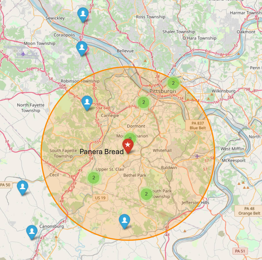
Since the code for mapping the geocoded data (latitudes and longitudes) is fairly lengthy, I don’t include it here. It’s available on GitHub. The result (including the 80%-radius) appears in Figure 4.
Switching gears now, I used one utility function to compute the as-the-crow-flies (a.k.a., great circle) distance between a member and a site...
from geopy.distance import great_circle

# Function to compute distance in miles,
# given a pair of (lat,lon)'s
def compute_distance(lat1, lon1, lat2, lon2):
    return great_circle((lat1, lon1), (lat2, lon2)).miles
and another to calculate the drive time.
# Define the departure time
wednesday_530pm = \
    datetime.strptime("2025-03-19 17:30:00",
                      "%Y-%m-%d %H:%M:%S")
departure_time = int(time.mktime(wednesday_530pm.timetuple()))

def get_drive_time(origin, destination):
    """Get drive time in minutes using Google Maps API
    with a fixed departure time."""
    try:
        response = gmaps.distance_matrix(origin,
                                 destination,
                                 mode="driving",
                                 departure_time=departure_time)
        if response["rows"][0]["elements"][0]["status"] == "OK":
            duration_seconds = \
              response["rows"][0]["elements"][0]["duration"]["value"]
            return duration_seconds / 60  # Convert seconds->minutes
    except Exception as e:
        print(f"Drive time exception {origin} -> {destination}: {e}")
    return None
Notice that you can specify a departure day and time. For me, that meant I could use the relevant day of the week and leave-for-the-meeting time for our members. I believe this feature was crucial to produce realistic drive times to inform our decision.
Previously, I used Tableau, a commercial software product. But I had let my license lapse, so it wasn’t an option. ↩︎
Janet is the nickname I’ve given to ChatGPT. It’s an homage to a character in the show, The Good Place. For details on producing this map, see the Appendix. ↩︎
In fact, the Panera is so close to 9 members that, in Figure 1, a green circle with a ‘9’ on it is almost completely obscured by the red marker for the Panera and an orange marker for a nearby high school. ↩︎
See Figure 4 in the Appendix to view the 80%-distance overlaid on the map. ↩︎
I used this 80% kind of metric often in my prior work. ↩︎
For more details on this topic, see the Appendix. If you’re wondering, it is possible – and important – to specify day of the week and time of day when calculating drive times. ↩︎
I’ll use member addresses as an example. An analogous process applies for geocoding the candidate locations. ↩︎
For security, I keep my API keys in a special file,
api_keys.py. I do NOT keep this file under GitHub control, but I do back it up locally. ↩︎