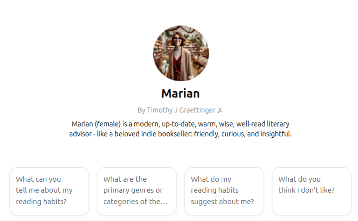
Making Marian, Your Personal AI Librarian, in 4 Simple Steps
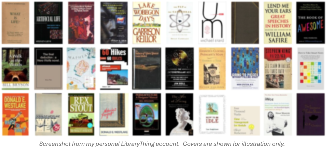
Tired of the lackluster book recommendations you get from GoodReads or Amazon? Suppose you could converse with someone who really know books, who knows your likes and dislikes. You can create your own, personal, custom GPT today to fill this role.