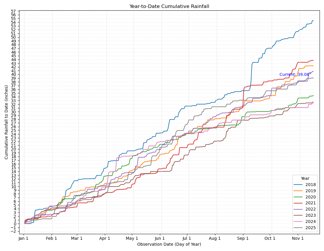
Ever create a chart and feel like it’s not quite right? That’s how I felt about the one above. My year-to-date rainfall plot is supposed to tell a story… but it doesn’t. Too many lines. Too many colors. No clear message.
On the horizontal axis, you see ticks for each month. The vertical axis marks the rainfall amount in inches. Each year gets a different color. And the text box shows the current year’s total: 39.06 inches.
This chart is packed with info. What’s not to like?
Plenty, in my opinion. First, the chart is supposed to give you a sense of how this year’s rainfall compares to previous years. Can you tell? It’s certainly not obvious to me. Can you even pick out the line for 2025 amid all the others? And it feels cluttered to me with all the grid lines, all the labels on the vertical axis, and all the colors in the legend.
When I’m struggling with a chart, I find it helpful to ask the question: “What’s the story?” There should be a story — and only one. But I can’t find it in this chart as it is.
To uncover it, I used a process I call addition by negative subtraction1. This chart needs less, not more. Here, I started subtracting by:
- Simplifying the grid with fewer ticks and labels on the vertical axis.
- De-emphasizing the grid by using a lighter shade of gray.
- Removing colors: I grayed out the previous years and colored the current year orange.
- Streamlining the legend as a by-product of the color changes.
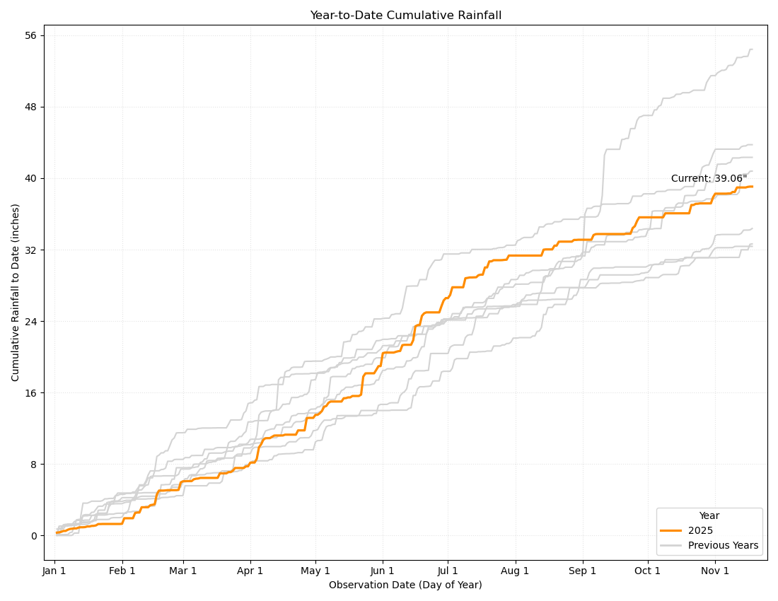
Now, the orange line for the current year really pops. The grayed-out prior years still provide context, but they’re more like the rings of a tree. The history is there, but it doesn’t obscure the present.
With these changes, can you read the story of 2025 rainfall? Try it, then read my take:
In 2025, precipitation started out very low, but it moved into the middle of the pack in early April. With plentiful rainfall in June and July, 2025 surged to the second-highest level on record. After that, rainfall flattened out, and 2025 fell back close to the historical average.
A good chart should tell a story to your viewer — clearly, simply, and at a glance. There needs to be enough detail to tell the story, but no more.
Next time you’re wrangling a chart, ask: “What’s the one thing I want my viewer to see?”. Use addition by negative subtraction and be ruthless. Cut out everything that gets in the way. Try it yourself and let me know how it goes. I think you’ll find that the simpler the view, the stronger and better the story.
“Addition by negative subtraction” is my tongue-in-cheek way of saying this: sometimes the best way to improve something is to take away its worst parts (the negatives). ↩︎